Job Title: UX Researcher & Designer at LandSure
Project Name: LandSure UX Research
Year: 2017-2018
LandSure Systems Ltd. is a subsidary of the Land Title and Survey Authority of British Columbia (LTSA). I initially worked as a co-op student in the position of Junior UX Researcher for a 4-month term before returning as a UX Designer for the rest of my time at LandSure.
Due to the digital submission platform being currently in development and under NDA, I have only shown my work as a UX Researcher on my portfolio. I am able to discuss in more detail my role and work as a UX Designer at LandSure in-person. Feel free to reach out if you're interested!
As a UX Designer, my role was to design and participate in all aspects of a new, digital, form submission platform used by legal professionals in conveyancing and land title transfers. I was part of the foundation for the project, as it started shortly after I joined the company, and participated throughout the first 1.5 years of its development. I created many sketch and digital wireframes and prototypes for various pages of the platform, consulted with team, business, engineer, and legal leads every week, and iterated frequently based on feedback from other departments, user tests, and new research or understandings of relationships between the various legal professions.
As a Junior UX Researcher, I was responsible for conducting user research of the customers and users of the various online platforms of LTSA. I worked with legal professionals (lawyers, notaries, paralegals, and conveyancers) to gain a deeper understanding of their needs and job processes in order to improve LandSure's current and future systems, making them more user-centric. I also created many user experience artifacts using the results of my research to present the information to others within the company and help drive the current company project towards a user-oriented design.
User experience research, user experience and interface design, wireframing in Balsamiq and Axure, compiling research results into different artifacts, writing professional documents (such as an expert review), customer consultation, and communication with both internal (other departments) and external (contracted companies, customers) professionals.
I used a variety of design research methods to consult with customers and understand the domain, their jobs, needs, pain points, tasks, and ultimately how their lives can be improved when using LandSure's current and future systems.
Customer and Internal Staff Workshops: I planned and co-facilitated two customer workshops with my manager. The goals of our workshops were to understand customers overall, as well as gain information the company needed in order to move forward with the new company project. I was responsible for creating some of the workshop activities, drawing large paper templates for customers to fill out during the activities, guiding customers and facilitating discussions during workshops, note taking, and compiling all the data gained from the workshops.
My manager and I also hosted three internal staff workshops - one with Technical Support, one with Practice and Policy (legal) Support, and a sketch design workshop with members of different departments. I helped plan activities, pinpoint information we needed to discover, and documented the results of all the workshops.
Customer Site Visits and Job Shadowing: My manager and I conducted customer site visits to gain information about customers on an individual level, as well as job shadow them to understand different firms' processes and tasks. I had a larger role in these customer site visits, as I was responsible for arranging site visits and dates with customers, creating a plan that detailed our goals and activities for the site visits, and coming up with a detailed list of questions to interview customers during the site visits. I was the main interviewer during the site visits, and actively contributed to discussions.
Internal Staff Call Shadowing: Shadowing Technical Support and Practice and Policy Support phone calls was another way to research issues users were having with our systems. I sat next to a Technical Support or Practice and Policy Support representative and listened on their phone line while they helped customers. This allowed me to hear the user recount their experience with our systems, the problems they ran into, and their emotions.
Customer Surveys: I created a printed customer survey that was distributed to customers during workshops and collected at the end. The survey's goal was to see if there were connections or patterns between points of data such as firm size, years of experience, and responsibilities. I compiled the results of the survey into an Excel spreadsheet, and later created a more detailed survey online using SurveyMonkey that would be sent to consulted customers.
I created personas of our three primary user groups: lawyers, notaries, and paralegals, at the beginning of my work term using information from the persona activity of the first customer workshop. I followed brand colors and updated the personas after every internal/customer workshop, customer site visit, and call shadowing activity throughout the months. The personas were also shown to several customers in order to validate their accuracy.
Sections of the personas shown below have been censored due to confidential information.


The Lawyer persona and a comparison of conveyancing tasks between different legal roles are shown above. The personas were greatly useful in allowing new members of the design team, as well as other departments we worked with (the business department, engineers, and land title officers) to better understand the different types of LTSA customers. I received feedback from longtime members of LTSA that the personas had information they did not previously know about their customers.
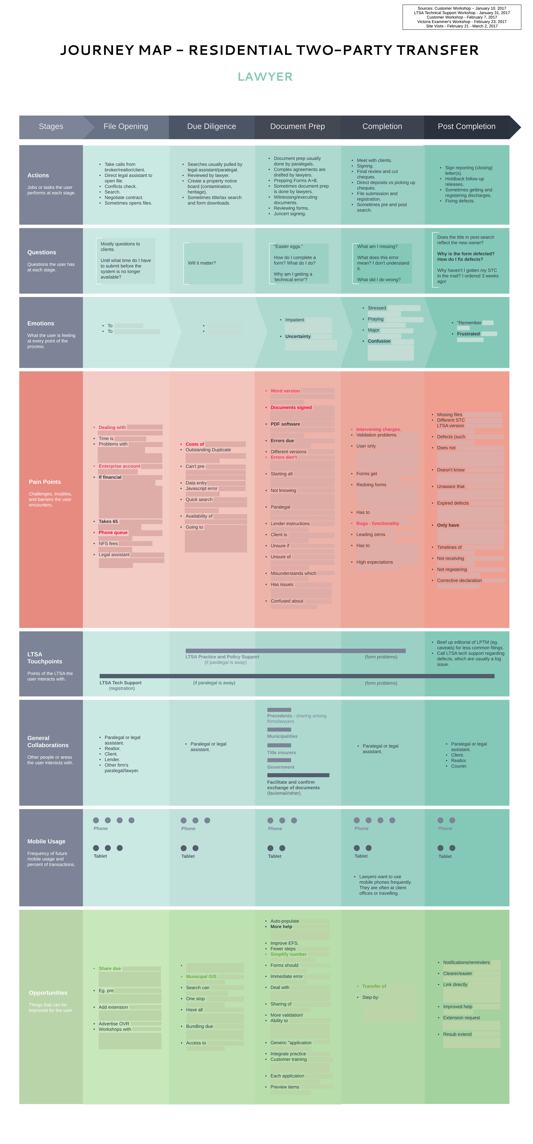
A major goal of the customer experience team I was in was to understand every part of the customer's experience through a particular task - conveyancing - thoroughly. This would help us design our future systems to make each step of their journey as painless as possible. I created three user journey maps, focused on lawyers, notaries, and paralegals, at the beginning of my work term - around the same time as the personas. These journey maps were also continuously updated as I obtained more information with my research methods.
Sections of the journey map shown below have been censored due to confidential information.

We were able to capture a large amount of information in our research, and I extracted data such as lawyers' tasks, pain points (problems), emotions, mobile usage, touchpoints (people or areas they interacted with), and opportunities (suggested improvements). The journey maps were continuously referred to during our later design process of the digital form submission platform, due to their breakdown of customer goals, pain points, and touchpoints.
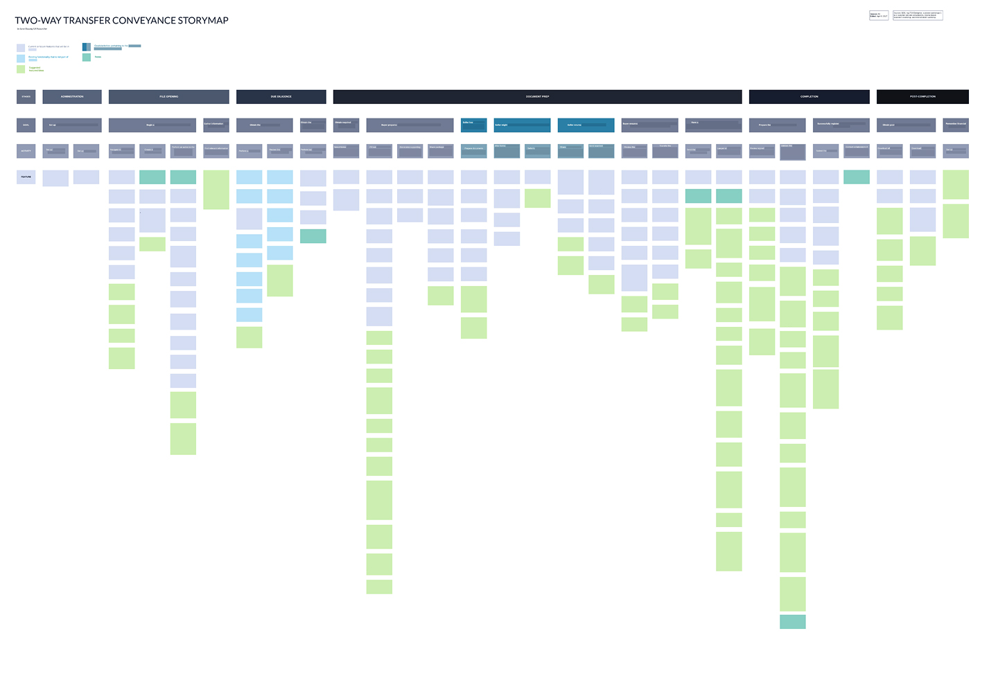
One of the most important mini-projects I worked on was a storymap of features required for users to successfully complete a conveyance using our future online platform. This storymap served a critical foundational document for my team, as well as others working on the future platform, to refer to in order to start wireframing and prototyping. It contains the stages of the main journey we are interested in for the user, their goals at each stage, the activities they do to complete each goal, and the features the system must have for them to complete those activities. I was responsible for the ideation, creation, design, and revision of this storymap.
All sections in the storymap have been censored due to confidential information. The original version of the storymap contains text in each box describing features the online platform will have (determined by the business) or suggestions for features that will improve the design and user experience of the platform.

I began the process of creating the storymap by referring to a Business Design document (a 150+ page documentation of the business needs and requirements of the new online platform, written by various stakeholders within the company for over a year) that contained all of the business needs of the platform. After extracting and matching information from the document to the goals and activities of the user, I went through each activity and brainstormed of what features/functionalities (that were not covered by the Business Design document) the user would need to complete it. I also envisioned what each web page the user is in might look like, along with details such as the types of interactions on the page, how the pages linked together, and the placement of elements to allow efficient completion of the activity. I cross-referenced my ideas with the Business Design document to ensure they did not contradict business requirements, and fleshed out the storymap over the course of 3 days.
After the initial storymap was done, I held a meeting between my team and several members of different departments to review the storymap. The meeting allowed for a general review of the storymap, and I made edits based on feedback. A signficantly more detailed review was given by an experienced member of the business team who had helped write the Business Design document. I made several iterations of the storymap with every piece of new feedback that I received, and filled in any gaps.
The storymap proved to be a highly useful artifact, as it helped connect our user research and the user's journey to actual features that could appear in wireframes. Before the storymap, our only starting point for designing a brand new online platform was the 150+ page Business Design document. The storymap I created not only extracts the most crucial points of information from the complex business document, but also contains more details and ideas of the system design - all from a user-centric point of view, based on user research my team had done and design best practices. When my team began to wireframe, we were able to refer to each column in the storymap to see what the user wanted to do, what they required to do it, and how features/interactions might look on the page.
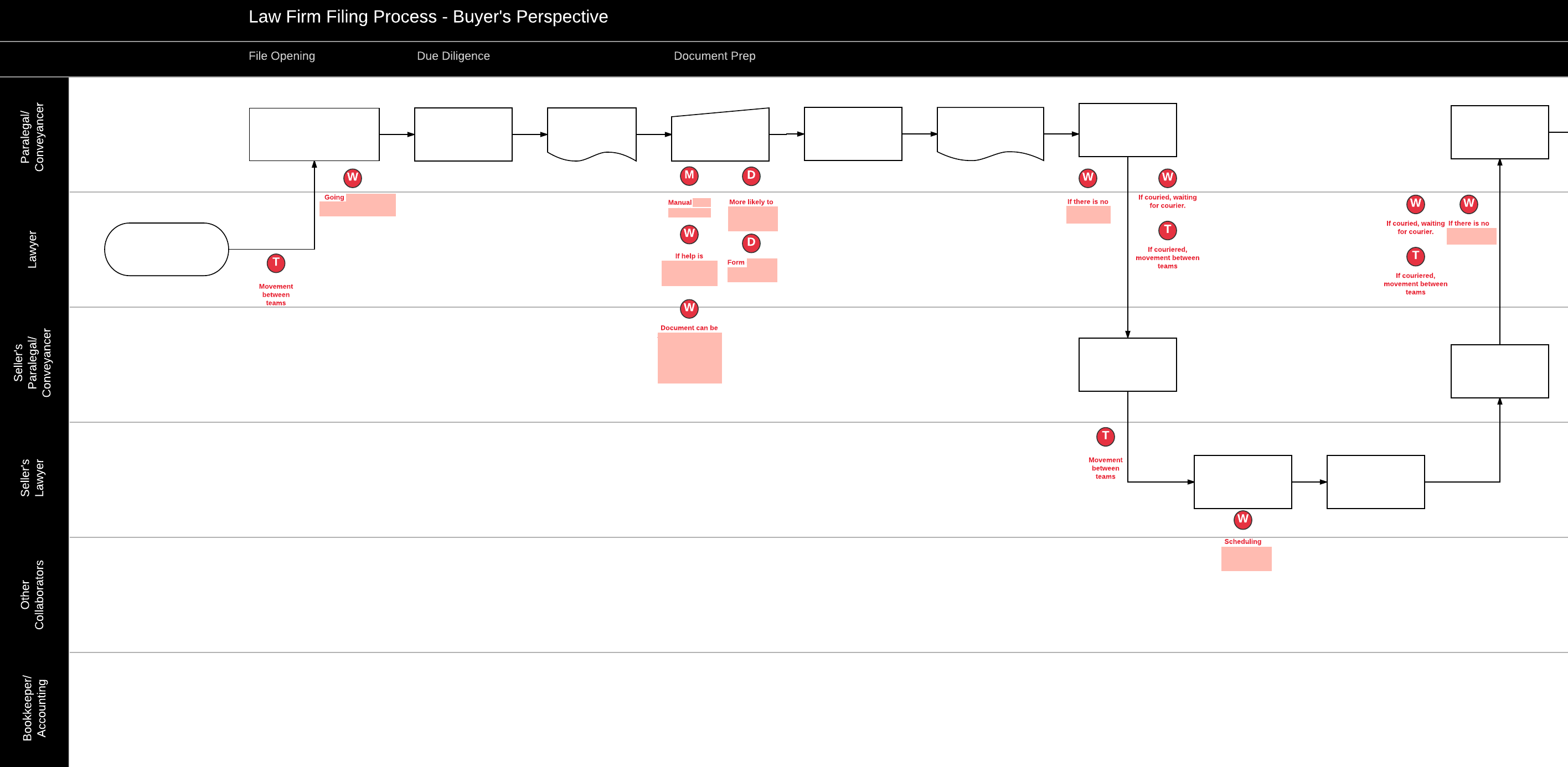
During my work term at LandSure, I also created a lean process map. The purpose of this diagram was to view the flow of each step of the conveyancing journey (from the perspective of the firm representing the buyer of a property). The map shows each step of the process (taken from the various user research I conducted), the relationship between different roles, and identifies areas of improvement. I used most of the information gained from my site vists and job shadowing of customers to make this detailed flowchart.
A section of the process map is shown below (click to view the full map). The boxes appear blank as they have been censored due to confidential information.
